Nothing Phone (2a) in for review
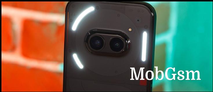
The Nothing Phone (2a) is finally here after weeks of leaks and teasers. It does have a Glyph interface, but perhaps more interesting than that is that the phone materializes Nothing"s first concept design from the company"s early months of existence back in 2020.
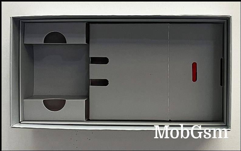
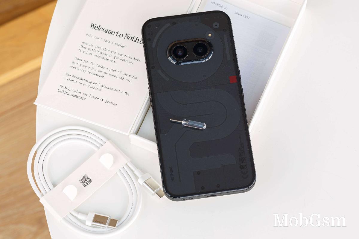
In true Nothing fashion, the Phone (2a) is full of character, all the way to the retail package and the SIM eject tool, which is transparent and cool with a fuse-esque look to it. The phone ships with a Nothing-branded USB-C cable, the SIM tool, and some leaflets.
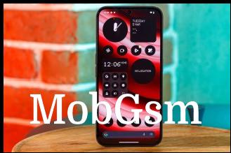
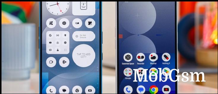
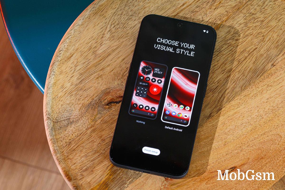
One thing that Nothing doesn"t get enough credit for is its take on Android (number 14 in this instance) - the interface is made with a lot of thought and is very stylish. More importantly, Nothing OS 2.5 is unlike anything else on the market - even the typeface is unique.
The OS is also highly responsive, and extra fluid on Nothing Phone (2a)"s 120 Hz display.
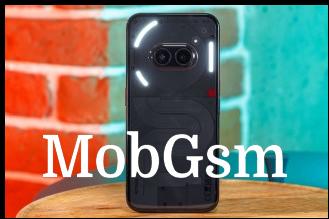
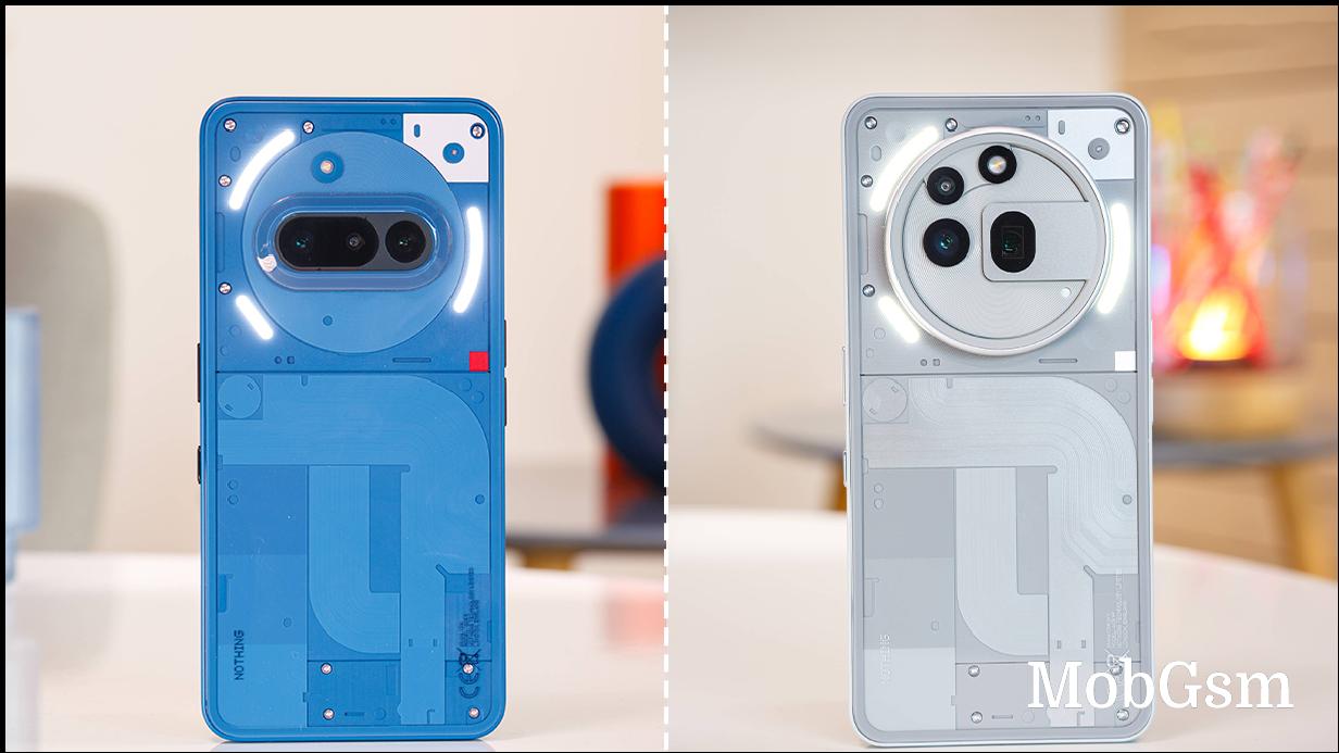
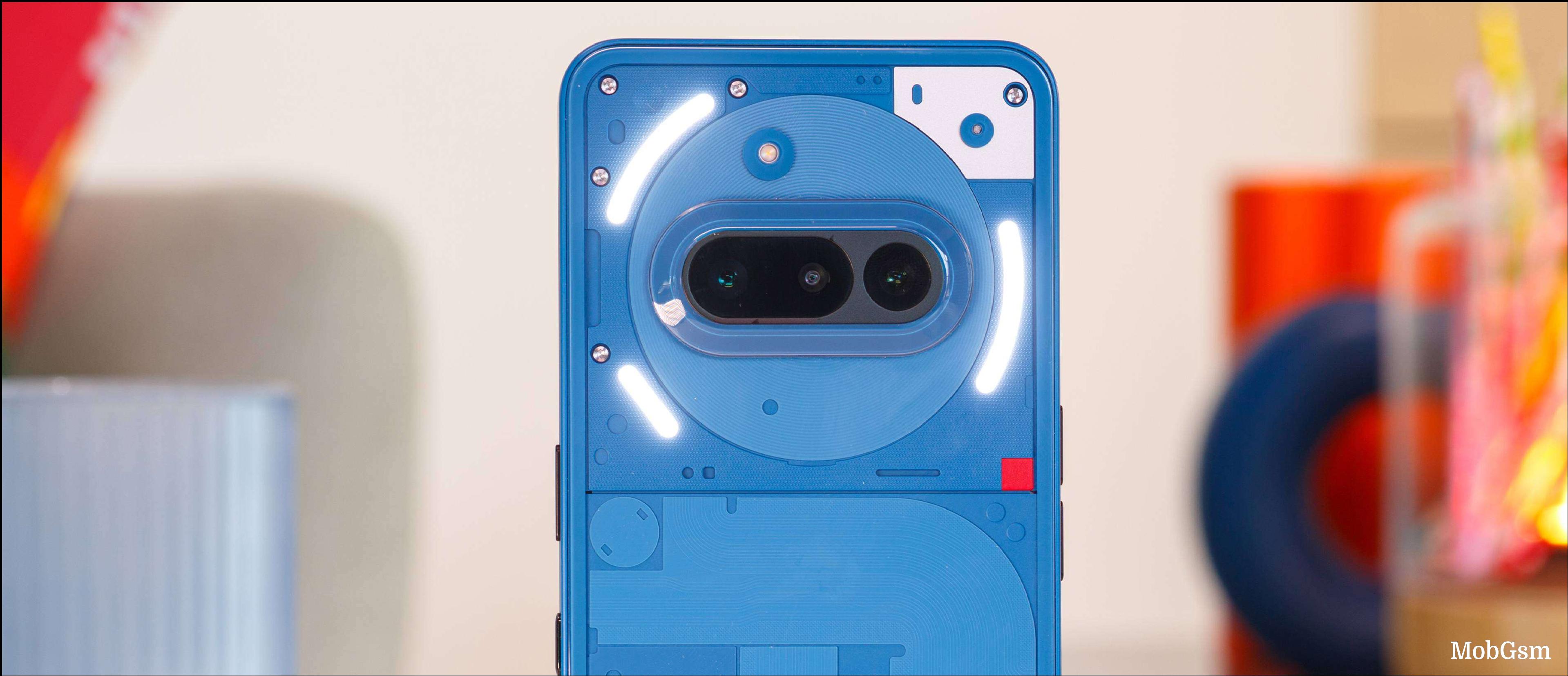
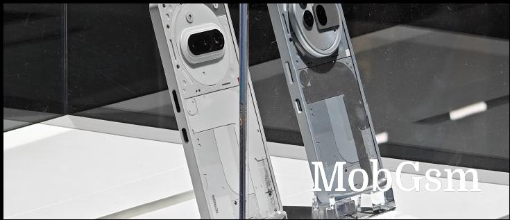
We have the Black model with us, but it also comes in White and "Milk". The flat display has a pre-applied plastic protector on top, which is a welcome addition. The rear panel is undoubtedly the most intriguing bit of the phone. It"s a transparent design where you can see part of the circuit board. The dual camera is centrally placed inside the NFC coil with the three Glyph lights flanking it.
It may look sophisticated, but the rear panel generates more static electricity than anything we"ve seen on a phone in a while. It grabs onto dust particles and doesn"t let go - keeping this panel clean is impossible.
The frame of the phone has a very pleasant matte finish to it. We"d call it primer-like for lack of a proper word. It feels soft and is very grippy and a pleasure to hold. Nice job, Nothing!
Stay tuned for more Nothing Phone (2a) content soon.


