Apple Watch Series 9 review

Apple announced the next generation Watch Series 9 in September, and it"s probably the most minor update Apple has ever released. I get it that Apple is not expecting users to upgrade their device every year but when the product highlights are the smartwatch"s carbon neutrality and the double tap gesture, it almost feels like Apple is selling an old model as new.
When I got the Apple Watch, I was at first amazed by its design, UI and functionality, overwhelmed even. Everything looked so shiny, smooth, and colorful - like touched by Apple"s proverbial magic.
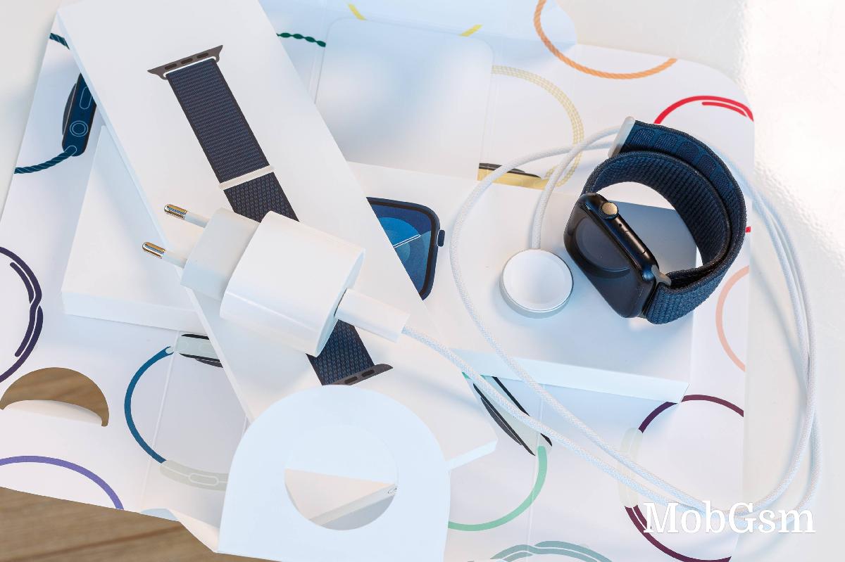
But once I got past the honeymoon phase, I realized the user experience was subpar. The Watch"s core functionality is scattered across many apps, with poor implementation of features and sheer dumbness of supposedly smart functions. And that"s before I get to the abysmal battery life.
The Apple Watch Series 9, in my experience, is nothing more than a gleaming piece of junk. Let me tell you why.
Design and build
But first, let"s have a look at the hardware you will be strapping on your wrist. That facade is really something to behold. Apple has been known for its hardware craftsmanship, and the Apple Watch is a fine specimen.
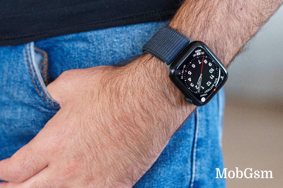
The Watch 9 is available in two sizes - 41mm and 45mm, and you start by picking one of the two models. Then, you choose between an aluminum and stainless-steel version. Then, you select the band bundle. And finally, you choose between GPS or GPS + eSIM capabilities.
I have the Apple Watch Series 9 45mm Aluminum with GPS, the black one with the Sport Loop textile band.
And even if it is one of the cheapest options on the menu, it still feels quite luxurious. The nearly bezel-less screen is an immediate standout, plus its Retina 326ppi is quite sharp for a smartwatch.
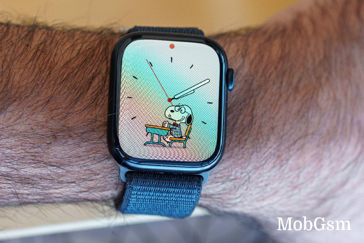
The screen is covered with slightly curved tempered glass. The frame is either made of aluminum with a matte finish (pictured) or stainless steel with a glossy finish.
The speaker is on its left side, while the digital crown and the side button are on the right side. You can swap the Watch orientation, of course.
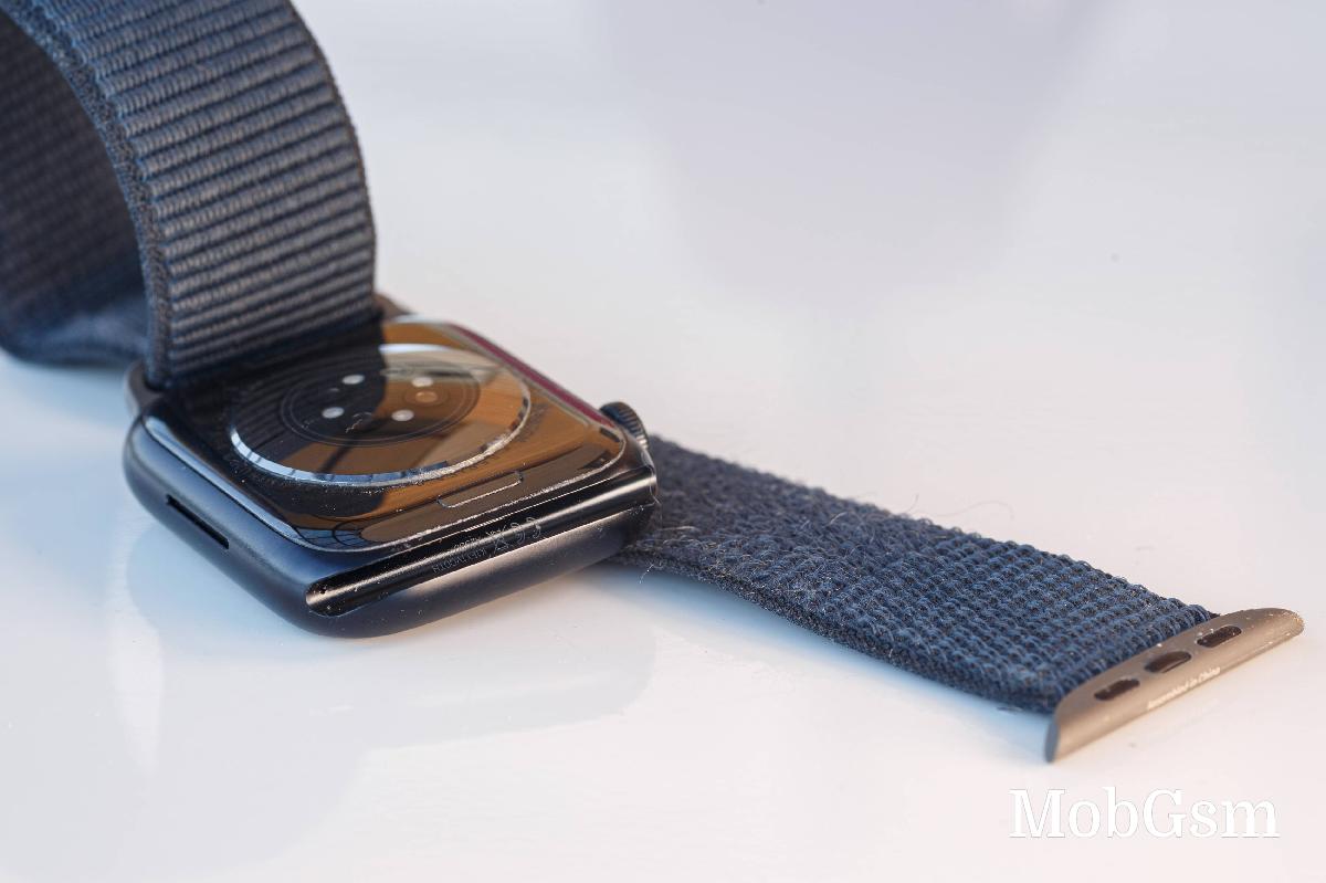
The digital crown has been a signature control on these watches, and it works flawlessly, and the haptic feedback is some of the best I"ve experienced. In fact, this goes to the entire haptic feedback on the Watch.
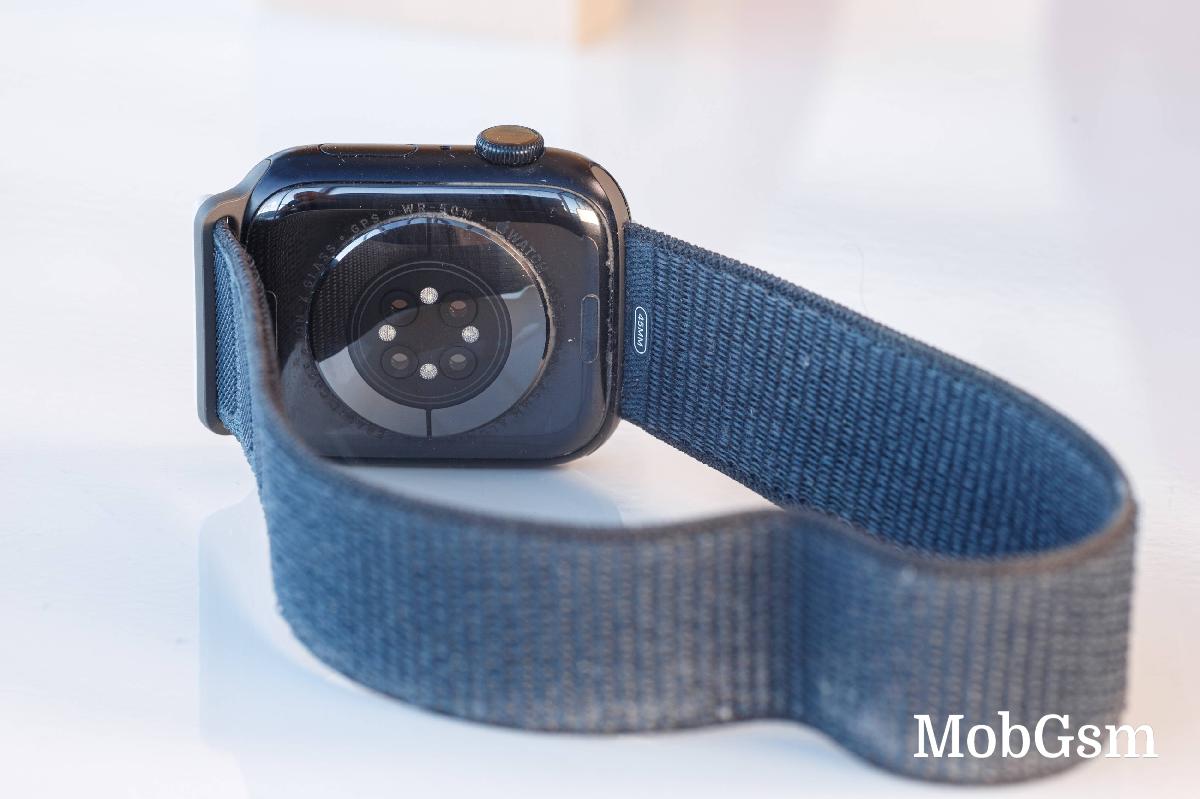
The bottom of the Watch is a combination of ceramic and sapphire-crystal glass, and it contains all sensors.
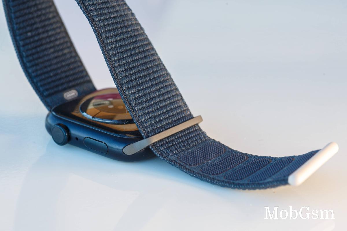
I got the Sport Loop band, which felt a bit cheap at first, but I can only applaud its durability. Apple has indeed created something that lasts. It has been through a whole lot, and yet - two months later, it looks like new.
The Apple Watch Series 9 is water and dust-proof, swim-proof, too. Overall, it offers a solid build and unique design, and we can agree it"s flagship-grade and well-executed.
Hardware
Apple Watch Series 9 is based on a new S9 system-in-package (SiP) with 60% more transistors than the outgoing S8 series chip. It boasts a 30% faster GPU and a new 4-core NPU. This will obviously speed up the OS with faster animations, and it"s claimed to offer all-day 18 hours of battery life - Apple"s wording, not mine. I acknowledge the snappier interface and interactions; there are no two ways about that.
The biggest benefit of this new S9 SiP is that it allows Siri requests to be processed on the device. This means much faster results as they don"t go to the cloud and back. Apple also promises 25% more accurate voice dictation. Oh, and Siri now has access to your Health data, making it easier than ever to check up on your key metrics. But as someone who doesn"t have a habit of issuing speech commands to my watch, I find this upgrade totally pointless.
The S9 also allows the new Double Tap gesture. This is the much-advertised new pinch gesture, where you tap twice by meeting your thumb and index finger in the air. It works by sensing changes in your blood flow and wrist movement via the accelerometer and gyroscope sensors. Double Tap allows you to play/pause music, snooze alarms, scroll through widgets, and pick up or hang up calls.
The software should learn how you use this gesture and allow for even broader use.
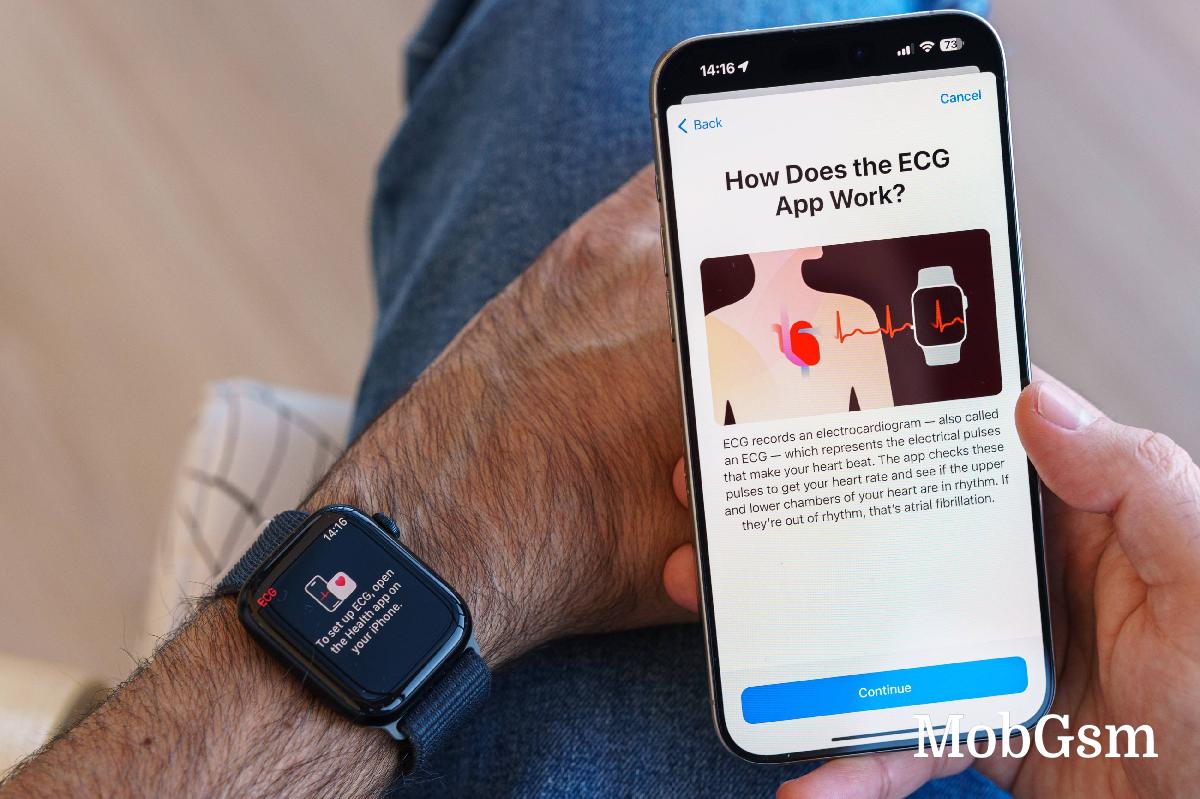
As far as sensors go, the Apple Watch has them all - blood oxygen, electrical heart sensor with ECG, optical heart sensor with high and low heart rate plus irregular rhythm detection, sleep tracking, temperature sensing, compass, altimeter, accelerometer, gyroscope, ambient light.
There is also Wi-Fi, Bluetooth 5.3, GPS, and NFC support, as well as option 4G LTE via eSIM.
The Watch 9 also gets a new UWB chip, which brings improved location tracking. You can still locate and ping your paired iPhone with even better precision. You also get improved integration with HomePod speakers.
Indeed, there is a lot of technology inside the Watch Series 9. If only it came together to bring the seamless experience I was hoping for.
Software
Apple Watch is the world"s most popular smartwatch. Some may even call it the best smartwatch out there. Then what went wrong? Well, it"s about two things - software and battery life.
The Apple Watch Series 9 has the best technology on the market at its disposal, and it is only natural Apple wants you to know it as the best smartwatch. But, after two months with it - I can conclude this is probably the dumbest of the mainstream smartwatches currently available on the market.
Basically, the Apple Watch is a jack of all trades and master of none.
First, you connect and set up your new Watch from the Watch app on the iPhone. From here, you can configure the notifications, app behavior, and various settings, and you can customize the watch faces.
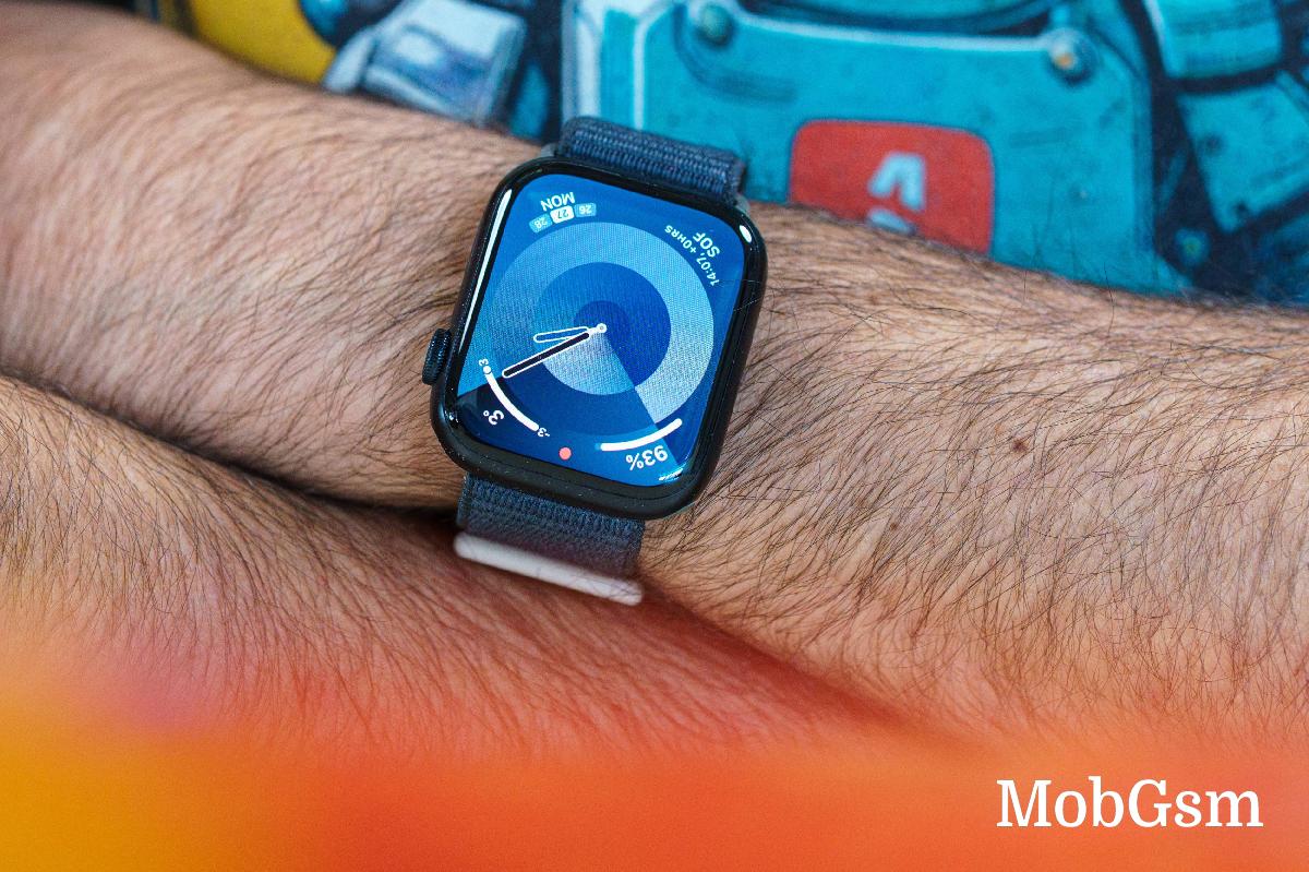
Apple Watch OS has gone a long way since the first version, and there are now a lot of watch faces. Most of them are quite simple, others - super advanced. Half of the available Watch faces support Complications - there are spots for tiny widgets, which show real-time information like weather, calendar, moon phase, date, etc.
Unfortunately, even though there are a lot of watch faces, most of them are either boring or childish. Some are utterly ugly and unusable, while others are beautiful and yet just too simple; you cannot even add a date as they don"t support any Complications on purpose.
Believe it or not, I spent three hours customizing this supposedly perfect watch face below and I still ended up with something that"s okay at best. And this is my Strike 1! The Apple Watch still doesn"t support third-party watch faces!
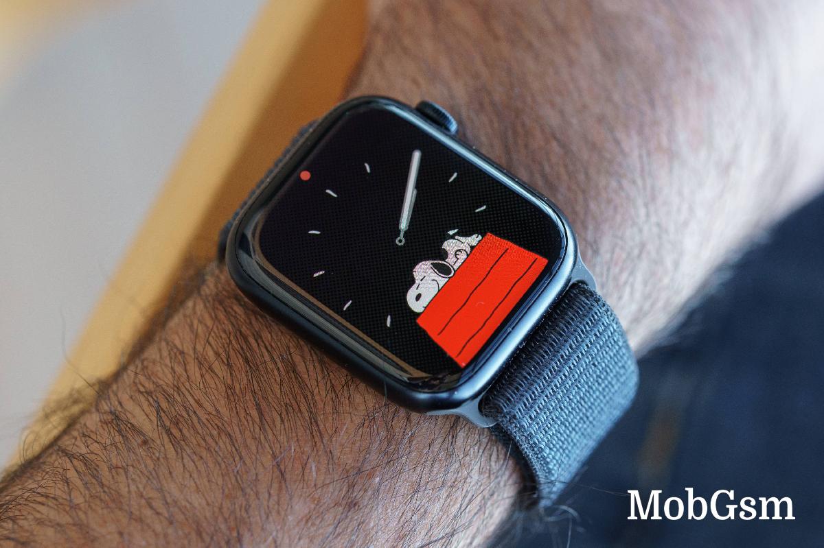
The Apple Watch Series 9 boots the latest watchOS 10. It brings a refreshed app look, new watch faces (Snoopy, Palette), new advanced mods like Cycling and hiking, and updated Health features to include mental and vision health.
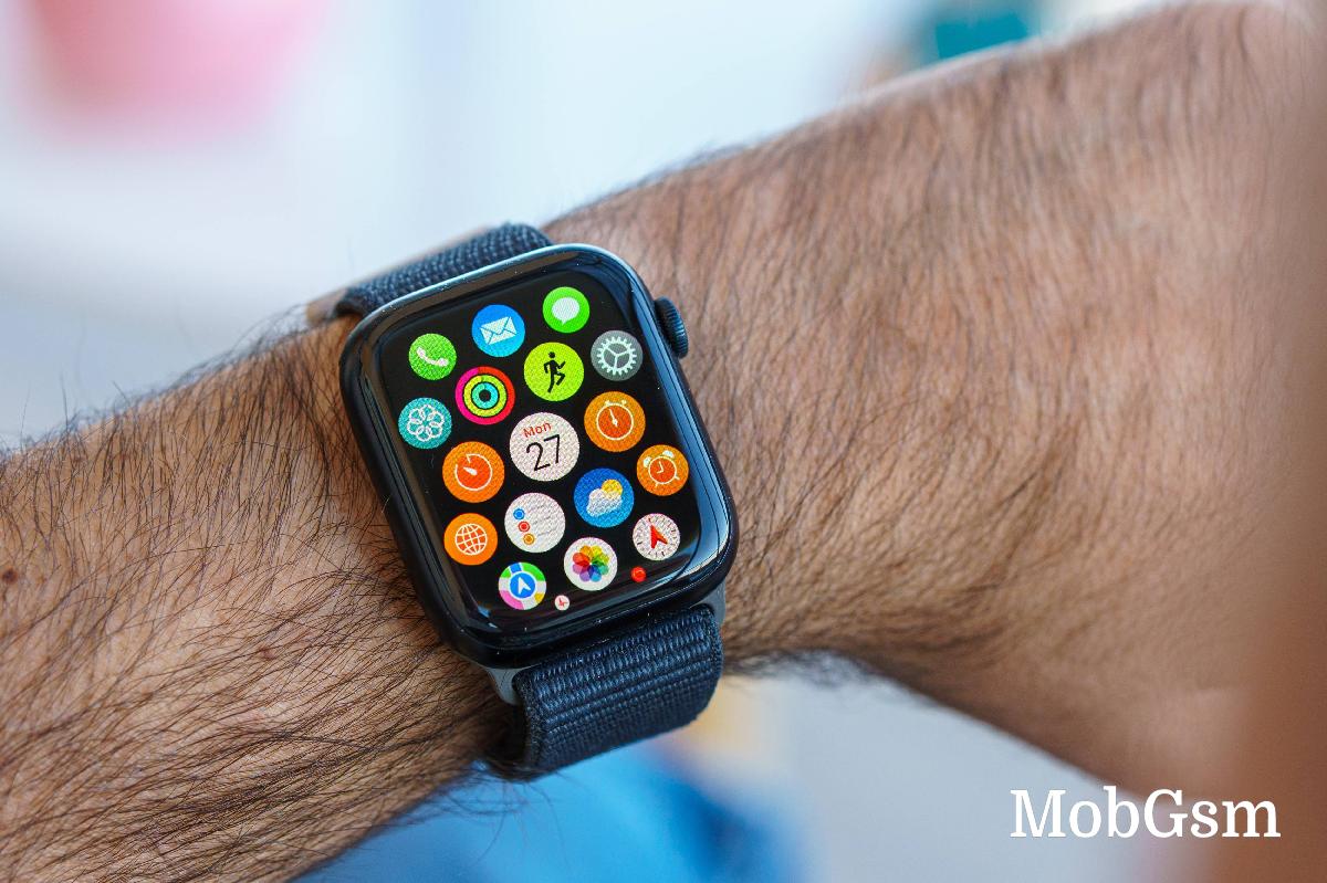
I will give it to Apple; they know how to make great app interfaces, and all system apps, such as World Clock, Weather, Fitness, Maps, Mail, Calculator, Phone, Messages, etc., look great and are optimized for watch use.
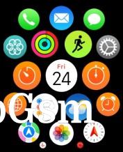
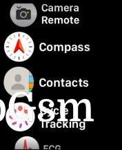
Pushing the digital crown will bring the app list. It can be a list, but the default view is a grid, which is quite clever. It can be navigated with the crown or with touch.
Control Center and Notification Center are available, and they are like mini versions of the ones in iOS.
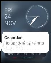
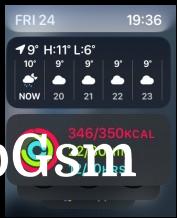
And a swipe on the watch face will reveal your big widgets.
Apple Watch has a dedicated App Store with mini versions of popular apps.
And these are the basics.
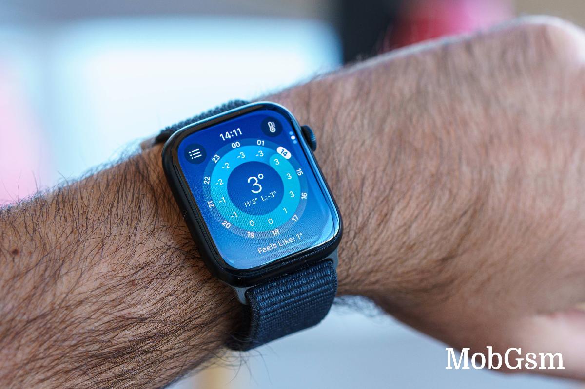
Now let"s talk about inferior user experience.
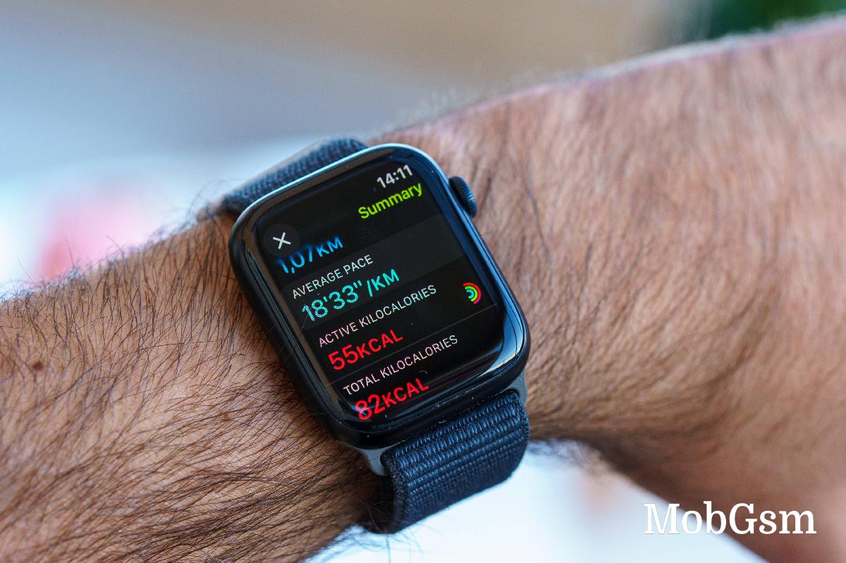
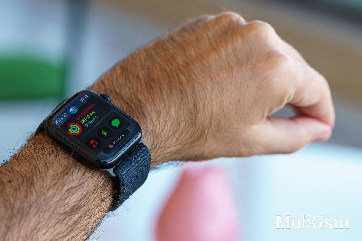
Imagine that - the most advanced smartwatch in the world can"t show your numerical step count easily and reverts only to graphical rings. Strike 2!
I am accustomed to checking out my numerical step count, and I find this omission quite annoying. Having to go to another app and then scroll through some stuff to see the step count is far from user-friendly.
Then, I also find the supposedly automatic smart features quite dumb.
Let"s start with Sleep. Would you imagine that the Apple Watch lacks any automatic sleep detection in contrast to 30-dollar sports bands by other companies? Instead, you have to configure a sleep schedule; this is the only time of day the Apple Watch would try to detect your sleep.
What happens if you take a nap in the afternoon? I will tell you why - the Watch would start objecting and vibrating, suggesting you move more, stand up, breathe, and drink some water - enough to wake you up.
I ended up turning off smart reminders like these, and I firmly believe no one should be forced to sleep on a fixed schedule just to enjoy sleep tracking.
This lazy implementation of sleep tracking is my Strike 3 for the Apple Watch! But wait, there is more.
Around this time, I was already starting to give up on the Apple Watch, but being a tech reviewer, I pushed through. And I ran into the inadequate sport tracking next.
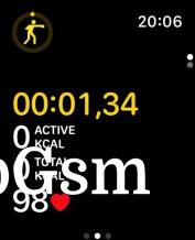
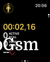
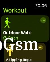
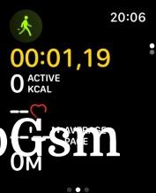
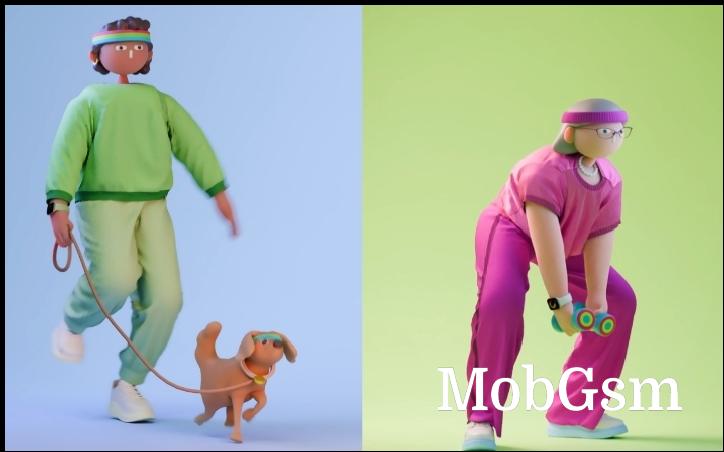
I discovered that the automatic sport detection works only sometimes. And then the sports modes are bogus, too - they all show calories, heart rate, and elapsed time but nothing sport-specific. Rope Jump - no rope count, boxing - no hit count. Here goes Strike 4. I’ve seen bands and watches in the sub $100 price range offering more adequate statistics.
The only well-implemented modes are the advanced ones like swimming, hiking, running, and cycling - they use the location data and can record and show various other metrics, too.
The individual apps for using sensors like blood oxygen, heart rate, and ECG - show accurate information, and the Watch will offer suggestions and even look out for abnormal heart rates.
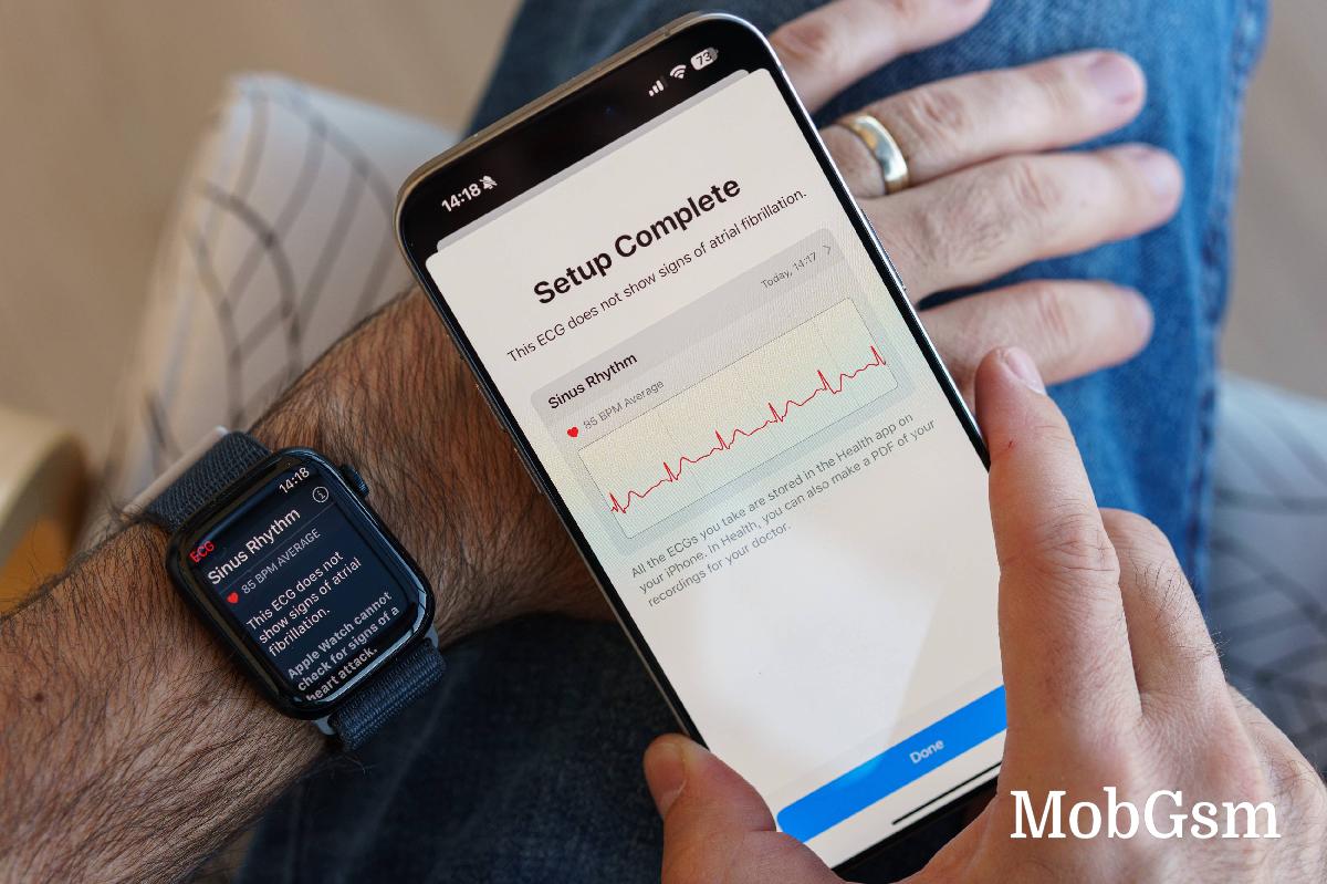
But the information about these vitals is spread across different places, and Apple doesn"t make it convenient to check everything you may be interested in in one go. The Health app on the iPhone has become overcrowded as well, and the information is scattered.
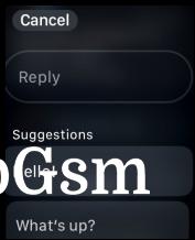
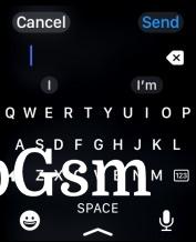
Finally, we get to communication and notification responses - the things of the highest importance, at least to me. Notifications are displayed nicely, and Bluetooth calls sound quite good. There are predefined responses for the keyboard, and you can quickly send a thumbs-up.
But - the keyboard, still new to these watches, is available only in a few languages, so if you are not using English, German, Spanish, Dutch, or French, you are out of luck. If you try to use the English keyboard to type in another language, you will have to arm-wrestle the autocorrect and the built-in swipe gestures. This makes text input look like a half-baked feature - adding more languages is not rocket science - why limit it to just five? And that counts as my Strike 5.
I"ve used other watches, Huawei, for example, and while it had dumber two-way communication, it was smarter in every other way. It did not need to wait for me to tell it when it was time for sleep or a workout.
Now let"s talk about the double-tap feature, which was supposed to be the Series 9 highlights. Apple added it a good month and a half after release, and I wish I could say the wait was worth it.
What soured the wait for me was that the Double Tap was already available on previous Apple Watch models under Accessibility. Apple just removed that feature from the Accessibility closet, slapped a Smart label on it, and made a new headline watch feature.
For what"s worth, it works fine, but I didn"t like using it because it"s slow. And I will not even bother to count that as a strike.
Battery life
And finally, we get to the battery life, which is ridiculously bad. It has to be the worst thing about the Apple Watch. It should be enough hint that Apple advertises the Watch for its all-day 18-hour battery life. You know, there are 24 hours in a day, Apple! It"s like Apple itself doesn"t want you to track your sleep, and that"s why it made it a nightmare to use. You cannot even use the sleep tracking if the battery is below 35%!
IN an effort to prolong the battery life I resorted to dumbing down some of the watch"s smart features. I turned off the heart rate tracking every minute and a few other things like Harmful Noise detection. So, with Always-on Display disabled, 1 hour of workout, about 30 checks of the time and 30 notification checks, one night of sleep tracking, and a few thumbs up on messages, I actually clocked 40 hours of battery life. So far, so well. But to get here, I had to turn off many of the wearable"s smart features, including all-day health tracking (leaving it on only for workouts and sleep). 40 hours of battery life with a bunch of disabled tracking features does not sound that much.
If you use GPS, take calls on the watch, and engage more in texting and health features, the Watch Series 9 will not last even a day - maybe 12-14 hours tops. And that"s with AOD off. And that is definitely worth a sixt strike!
For all it"s worth, the Watch 9 recharges quickly - 15 minutes on the charger will refill about 50% of its battery, while a full recharge (from about 10% battery) requires about 50-60 minutes.
Verdict
Good morning, breathe, drink water, breathe, stand up, slow down, run, breathe, go to bed. It seems Apple thought I needed a wearable to remind me to live. Are we there already?
The joke is really on me, as I bought this watch out of my own pocket. And the new Apple Watch is not worth getting. There is no Apple magic here - just a simple money grab for a half-baked technology. This is the most expensive and most popular smartwatch, but I found it to be as dumb as the first one, which I reviewed eight years ago.

There are too many apps and too many features scattered across them – ECG, Noise Detection, Activity, Bood Oxygen, Cycle, Reminders, Maps, Mail, Double Tap, Widgets, iPhone controls, Medications, Memoji, Shortcuts, Mindfulness, Photos, Remote, Calculator, Flashlight… I also found many of the sports modes to be too simple for their own good. I eventually gave up on most features out of battery considerations or for merely finding them too annoying.
I hated the first Apple Watch for its battery life eight years ago, and now I hate this one even more for being the same inadequate and inconvenient device. As I said - a jack of all trades, master of none.
It may have been built with the utmost attention to detail; it might have had the best UI designers in the world, and it may pack the most advanced chip and sensors and one of the brightest and most fluid displays. And yet, it is not worth putting up with its deficiencies. Trust me; I"ve used smart watches by most other brands. Save time, nerves, and energy and go get a Xiaomi, or Amazfit, or Huawei, or Garmin, or anything else, really. Your wallet will thank you, too.


