Nokia unveils Pure UI, a new user interface design language
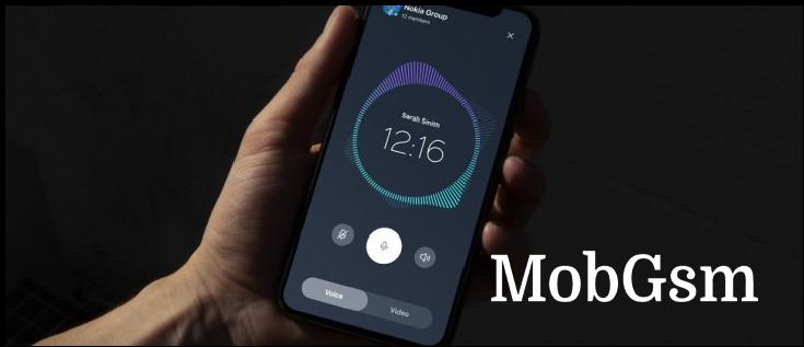
The Nokia Design Team has crafted a new user interface design language dubbed Pure UI. This is intended to be used on all kinds of other Nokia products (which apparently doesn"t include Nokia-branded products produced under license).
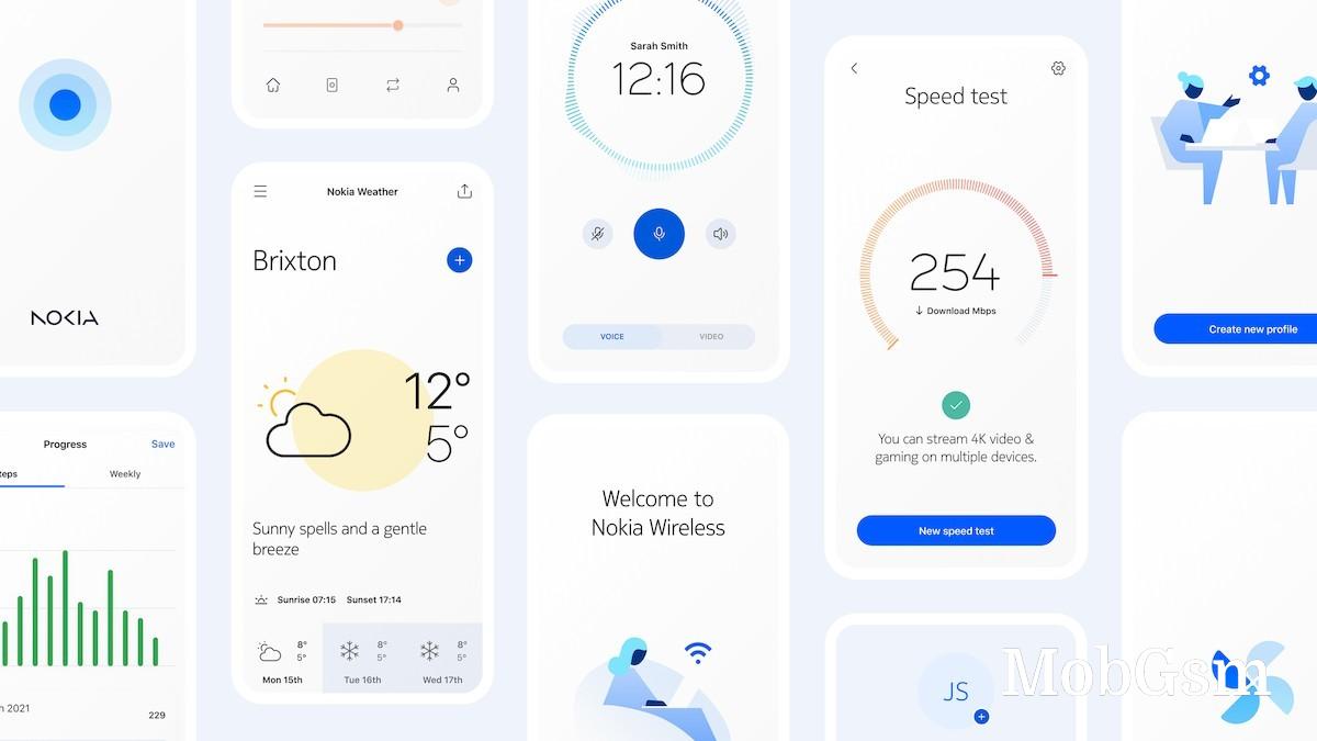
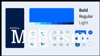
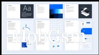
The design is intended to be consistent, flexible and future-proof and has a clean, minimalistic look, which is the leading design trend right now. There are multiple components, starting with templates and guidelines that determine the overall look.
A major part of the new look is the Nokia Pure typeface, which will be used throughout the UI.
New icons have been designed for Pure too. They are based on strokes, the thickness of which can be varied to match the display requirements and capabilities of a given device. They also include smooth animations when a particular component needs to catch the user’s attention.
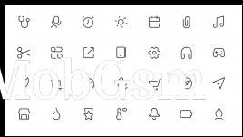
The Nokia Pure Icons are based on geometric shapes
The Nokia team has also prepared standard elements that designers can use to quickly build consistent-looking screens.
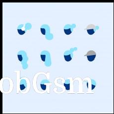

App screens will have a consistent look, thanks to the Pure Illustrations
Dark mode is supported, of course, with elements and icons adjusting their styles accordingly.


Nokia Pure icons and dark mode support
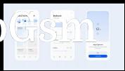
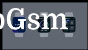


Nokia Pure is suitable for all manner of displays
Nokia Pure UI has powerful components that can be used to build complex web-based dashboards, for example. The interface is designed to scale from tiny wrist-worn displays to large wall-mounted panels.


The Nokia Pure UI can be used to build complex, information-rich dashboards
Check out the NokiaPure.com page for a closer look at the new interface.


