WhatsApp gets a new, fresher look and a darker dark mode
Today WhatsApp has made its latest design official. This has been rolling out in stages already, adding a native bottom navigation bar on Android. The app has also received a fresh coat of paint, with the new color palette being chosen after 35 different options were considered.
WhatsApp says it focused on deeper tones to reduce eye strain in low-light conditions, which is also why the app"s dark mode is now one shade darker to make it easier to read messages.
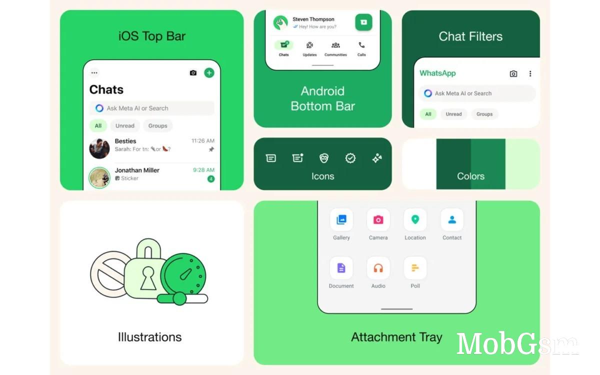
Over on iOS, it"s easier to send photos and videos thanks to a new attachment layout - instead of a full screen menu, you get an expandable tray that lets you see options more easily when sending media and documents.
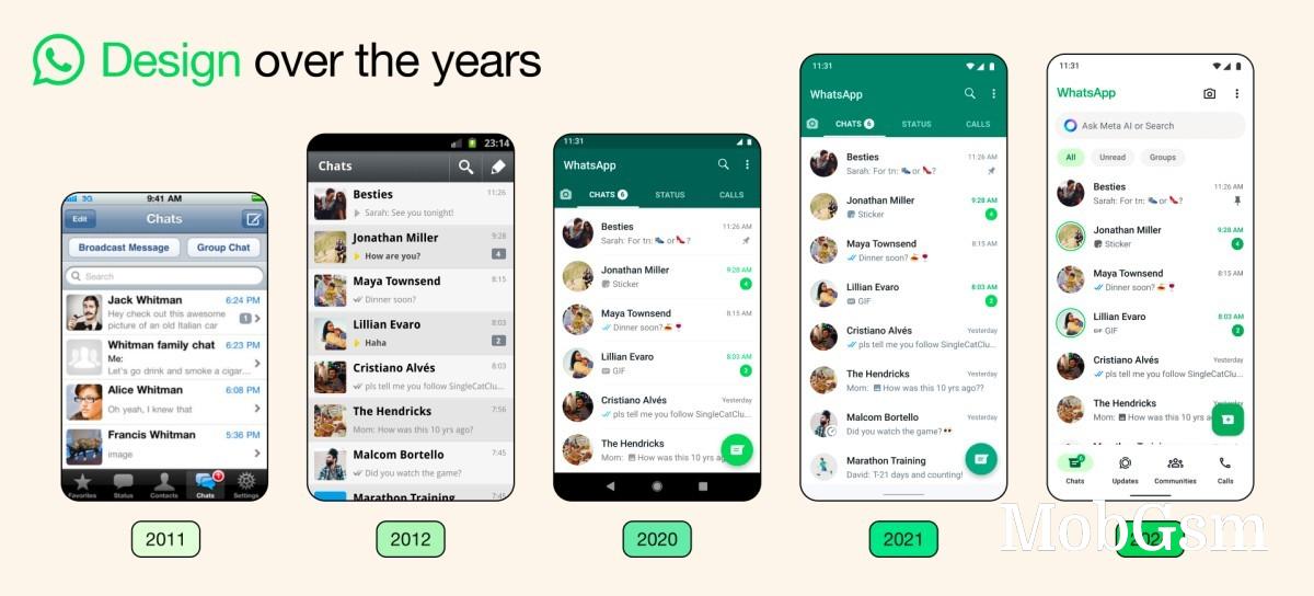
The icons inside the app are getting an update too, with a more rounded, outlined style, and the default background in chats is new as well.


