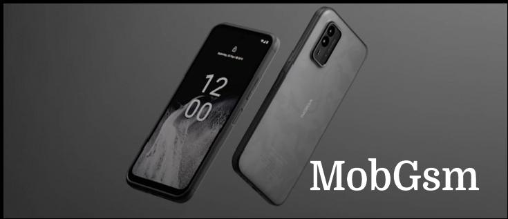
Flashback: Nokia N9 was ahead of everyone but went nowhere

Nokia’s Symbian phones are often seen as the big victim of the Nokia-Microsoft alliance, but the truth is that the old OS was dying already. There was a promising new OS on the horizon poised to replace it, unfortunately it powered only one phone in its short existence – Nokia N9.
Development of Symbian and Linux-based OSes was scrapped so that the company could focus on its upcoming Lumia line (powered by Microsoft’s Windows Phone OS). This was quite unexpected as MeeGo, N9’s operating system, had two giants backing it.
The family tree is complicated, but the simple way to describe it is that MeeGo is the child of Nokia’s Maemo and Intel’s Moblin, two mobile-focused Linux distributions. Moblin was Intel’s attempt to provide an alternative to Windows XP and 7 as the OS of choice for netbooks, so in a way it died two deaths at the hand of Microsoft.
The Nokia N9 was Finland’s answer to the iPhone – a sleek handset with software built from the ground up for touchscreen operation. It was a premium device and a much stronger challenge to the Apple phone than the Nokia 5800 ever was.


Size (and looks) comparison: iPhone 4 vs. Nokia N9 vs. Samsung Galaxy S II • Nokia N9 vs. N8
The Finns had built a phone that was several steps ahead of everyone else. The N9 was the first phone to sport 64GB of built-in storage – 64GB packed in an eMMC chip. The iPhone 4S would match that maximum a few months later, but it was down on RAM – the Nokia had 1GB, twice as much as the 4S.
The 3.9” AMOLED screen feels quite modern even today. It had a tall aspect ratio (16:9) and Gorilla Glass with beveled sides. There were no hardware buttons on the front, the UI was navigated entirely by swipe gestures, years before Apple and Google followed suit.
There was no “home” button, a swipe is all it takes to minimize an app and go to the homescreen. Another swipe brings up the app switcher. Tap the status bar and you get ringer settings plus quick toggles for the wireless connections (Wi-Fi and Bluetooth). You could also change your Skype and Facebook status from here.
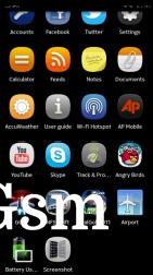
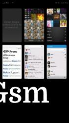
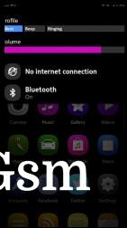
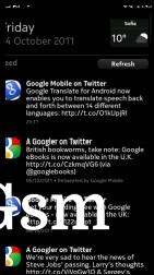
App launcher • Recent apps • Quick toggles • Feed
The beveled sides of the screen glass actually helped with the gesture navigation. Gestures started at the edge of the screen, which was easy to find by touch thanks to the bevel. Other swipes just panned around a web page in the browser or a photo in the gallery.
Look at it go, the single Cortex-A8 core (1GHz) was running things quite smoothly. We tried stress testing it with 15 apps or more opened in the background and everything remained silky smooth. And keep in mind that most 2011 flagships had dual-core CPUs and still very few felt this fast.
Here’s another interesting detail – each browser tab was treated as a separate app by the OS. This would be adopted by Chrome for Android a few years later with the Nexus 6. To be fair, people complained so much about this feature that Google was forced to make it optional.
In a way, the phone"s influence lasted longer than the phone itself did - Nokia reused the N9 design for its first Lumia handsets. They had the same general shape and premium polycarbonate body. The advantage of this material was that it wasn"t painted - all of it was the same color, so a scratch won"t reveal a graying metal or plastic underneath.


Size (and looks) comparison: Samsung Omnia W vs. Nokia Lumia 800 vs. Nokia N9
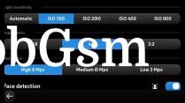
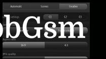
The Nokia N9 was the first to pull off a trick that was later used in the 808 PureView. It packed an 8.7MP sensor, which could effortlessly switch between 4:3 and 16:9 aspect ratios (resulting in 8MP and 7.1MP photos respectively).
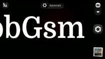
Look at the camera UI, it clearly inspired the Symbian redesign for the 808.
A bit of a history course for non-programming geeks. Nokia owned Qt back then (it’s pronounced “cute”), a cross-platform application framework. While widely used for developing Linux and even Windows apps, Qt was also the main platform for Symbian S60 app development since the 2010.
This was the genius part of Nokia’s plan – Symbian still had a massive user base, which is important for kickstarting an app’s popularity. Then the move to MeeGo would be easy. However, as Nokia announced that it’s killing both platforms, devs moved on to Android and iOS.
There were rescue attempts – Alien Dalvik tried to run Android apps on the N9 and there were even full Android ports developed, but it just wasn’t enough.
The Nokia N9 was ahead of the competition but ended up going nowhere. It’s easy to blame Microsoft for it, but there are stories of friction between Nokia’s internal teams that prevented its Linux-based efforts from going mainstream. Still, we’re glad that we got to enjoy the N9, even if it was an evolutionary dead end.


